summarize a data set with multiple categories using a frequency table, dot plot, pictograph, or bar graph with scaled intervals
Track each student's skills and progress in your Mastery dashboards
Give this quiz to my class
Q 1/5
Score 0
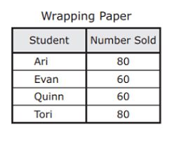
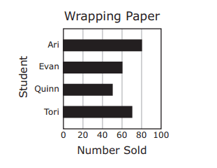
The graph shows the number of rolls of wrapping paper sold by four students. Which table represents the information in the graph?
60
Q 2/5
Score 0
60
5 questions
Q.
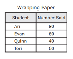
The graph shows the number of rolls of wrapping paper sold by four students. Which table represents the information in the graph?
1
60 sec
3.8.A: Data Analysis
Q.
2
60 sec
3.8.A: Data Analysis
Q.
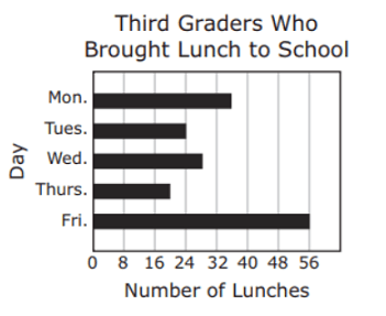
The bar graph shows the number of third graders who brought lunch to school each day last week. Which table best represents the data in the graph?
3
60 sec
3.8.A: Data Analysis
Q.
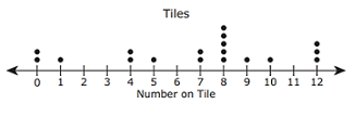
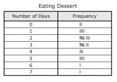
The frequency table shows the results of a survey about how many days per week some families eat dessert. Which dot plot represents the data in the table?
4
60 sec
3.8.A: Data Analysis
Q.
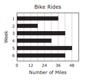
The graph below shows the number of miles Lincoln rode his bike during six weeks. Which table represents the information in the graph?