solve one- and two-step problems using data from a frequency table, dot plot, bar graph, stem-and-leaf plot, or scatterplot
Track each student's skills and progress in your Mastery dashboards
Give this quiz to my class
Q 1/6
Score 0
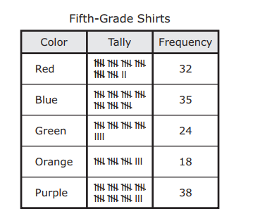
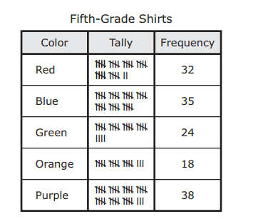
The frequency table shows the colors that fifth graders preferred for their school shirts. Based on the data in the table, how many students preferred the three colors that had the highest frequencies?
60
38
105
91
147
Q 2/6
Score 0
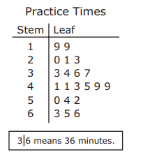
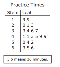
The stem and leaf plot shows the numbers of minutes the members of a team jumped rope during practice. What is the difference between the least number of minutes jumped and the greatest number of minutes jumped?
60
47
5
9
49
6 questions
Q.
The frequency table shows the colors that fifth graders preferred for their school shirts. Based on the data in the table, how many students preferred the three colors that had the highest frequencies?
1
60 sec
5.9.C: Data Analysis
Q.
The stem and leaf plot shows the numbers of minutes the members of a team jumped rope during practice. What is the difference between the least number of minutes jumped and the greatest number of minutes jumped?
2
60 sec
5.9.C: Data Analysis
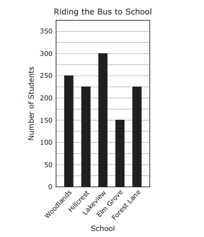
Q.
The graph shows the number of students at five schools who ride the bus to school. Based on the graph, how many students ride the bus to the Woodlands, Hillcrest, and Lakeview schools?
Be sure to use the correct place value.
3
60 sec
5.9.C: Data Analysis
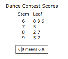
Q.
The stem and leaf plot shows the scores of eight people at a dance contest. What is the difference between the highest score and the lowest score?
4
60 sec
5.9.C: Data Analysis
Q.
5
60 sec
5.9.C: Data Analysis
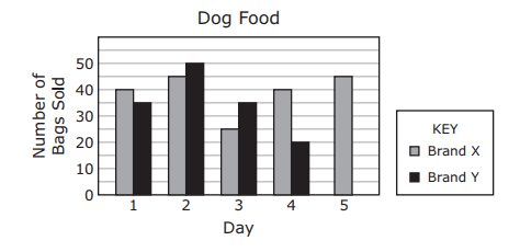
Q.
The bar graph shows the numbers of bags of two brands of dog food that were sold at a store. One bar for Day 5 is missing from the graph. The number of bags of Brand Y dog food sold on these five days was 175. Which bar represents the data for Day 5 for Brand Y?