solve problems using data represented in bar graphs, dot plots, and circle graphs, including part-to-whole and part-to-part comparisons and equivalents
Track each student's skills and progress in your Mastery dashboards
Give this quiz to my class
Q 1/5
Score 0
60
Q 2/5
Score 0
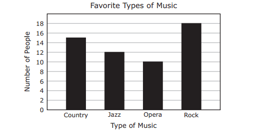
Maribel surveyed 55 people to find out their favorite types of music. The results are shown in the bar graph. Based on the information in the graph, which types of music were chosen by 40% of the people surveyed?
60
Jazz and opera
Jazz, opera, and rock
Country and opera
Country, jazz, and rock
5 questions
Q.
1
60 sec
7.6.G: Proportionality
Q.
Maribel surveyed 55 people to find out their favorite types of music. The results are shown in the bar graph. Based on the information in the graph, which types of music were chosen by 40% of the people surveyed?
2
60 sec
7.6.G: Proportionality
Q.
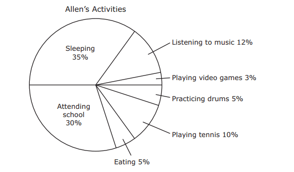
The circle graph shows Allen’s activities during 24 hours. How much more time in hours did Allen spend listening to music than playing tennis?
3
60 sec
7.6.G: Proportionality
Q.
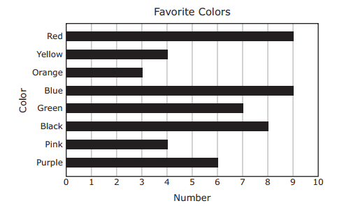
The graph shows the favorite colors chosen by some middle school students. Which statement is supported by the information in the graph?
4
60 sec
7.6.G: Proportionality
Q.
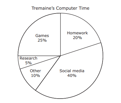
The circle graph shows how Tremaine divided his time on the computer last week. Tremaine used the computer a total of 30 hours last week. How many more hours did Tremaine use the computer to play games than to do research?