

Heating curves: practical
Quiz by Oak National Academy: GCSE Chemistry Edexcel Foundation
Feel free to use or edit a copy
includes Teacher and Student dashboards
Measure skillsfrom any curriculum
Measure skills
from any curriculum
Tag the questions with any skills you have. Your dashboard will track each student's mastery of each skill.
With a free account, teachers can
- edit the questions
- save a copy for later
- start a class game
- automatically assign follow-up activities based on students’ scores
- assign as homework
- share a link with colleagues
- print as a bubble sheet
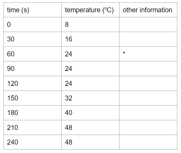
- Q 1/6Score 0The table shows data from a heating curve experiment. What is the main reason why it is helpful to plot a graph of these results?29it shows the whole range of resultsit shows patterns in the resultsit shows the temperature change between any two timesit shows the temperature change every 30 seconds


6 questions
Show answers
- Q1The table shows data from a heating curve experiment. What is the main reason why it is helpful to plot a graph of these results?it shows the whole range of resultsit shows patterns in the resultsit shows the temperature change between any two timesit shows the temperature change every 30 seconds30s
- Q2Match the key terms to their definitions.Users link answersLinking30s
- Q3What can you do to improve the reliability of a set of results?Users sort answers between categoriesSorting30s
- Q4The table shows data from a heating curve experiment. What would be useful other information to record for each measurement?Users sort answers between categoriesSorting30s
- Q5The image shows a results table from either a heating or a cooling curve experiment, and from either a pure substance or a mixture. Which of the following statements is true?this is a heating curve for a mixturethis is a cooling curve for a pure substancethis is a cooling curve for a mixturethis is a heating curve for a pure substance30s
- Q6Considering the data in the table at the start of the experiment, which graph would be the most likely to represent the results for the whole experiment?30s


