Interpreting scatter graphs
Quiz by Oak National Academy: KS3 Maths (2)
Feel free to use or edit a copy
includes Teacher and Student dashboards
Measure skillsfrom any curriculum
Measure skills
from any curriculum
Tag the questions with any skills you have. Your dashboard will track each student's mastery of each skill.
With a free account, teachers can
- edit the questions
- save a copy for later
- start a class game
- automatically assign follow-up activities based on students’ scores
- assign as homework
- share a link with colleagues
- print as a bubble sheet
6 questions
Show answers
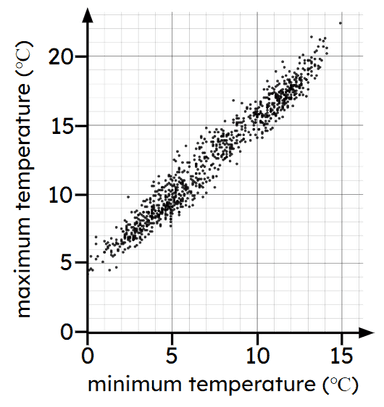
- Q1The scatter graph show minimum and maximum temperatures for different months in a town. Which statement best describes the trend in the data?There is no connection between the variables.Months with higher minimum temperature have lower maximum temperatures.Months with higher minimum temperature have higher maximum temperatures.30s
- Q2Which scatter graphs shows a case where as one variable increases the other variable tends to decrease?30s
- Q3Look at the scatter graph. A new month records a minimum temperature of 10 degrees Celsius. Which range could we expect the maximum temperature to be in?19 to 21 degrees Celsius14 to 17 degrees Celsius4 to 6 degrees Celsius8 to 11 degrees Celsius30s
- Q4Look at the scatter graph. A new month records a maximum temperature of 10 degrees Celsius. Which range could we expect the minimum temperature to be in?14 to 17 degrees Celsius19 to 21 degrees Celsius4 to 6 degrees Celsius8 to 11 degrees Celsius30s
- Q5______ is the process of estimating unknown values that are inside the range of existing data.Users enter free textType an Answer30s
- Q6Which statement is true?Interpolation is more reliable than extrapolation for estimating data.Extrapolation and interpolation are equally reliable for estimating data.Extrapolation is more reliable than interpolation for estimating data.30s
