Tag the questions with any skills you have. Your dashboard will track each student's mastery of each skill.
Give this quiz to my class
Q 1/10
Score 0
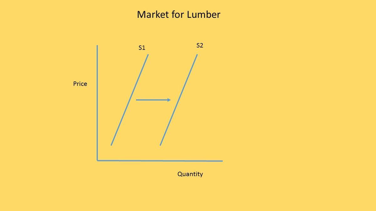
Which is the most likely explanation for the change shown in the graph?
120
Technological advancement causing increased fuel efficiency in logging equipment.
Decreased demand for finished wood products.
Increased minimum wage.
Widespread wildfires that destroy vast amounts of forest.
Q 2/10
Score 0
What would be the MOST LIKELY result of an increased unemployment rate?
120
DEMAND curve shift to the LEFT
SUPPLY curve shift to the RIGHT
SUPPLY curve shift to the LEFT
DEMAND curve shift to the RIGHT
10 questions
Q.
Which is the most likely explanation for the change shown in the graph?
1
120 sec
Q.
What would be the MOST LIKELY result of an increased unemployment rate?
2
120 sec
Q.
Which of these is the government trying to achieve through PRICE CONTROLS?
3
120 sec
Q.
Which of these is shown in the graph?
4
120 sec
Q.
Which of these is an EXAMPLE of the price control shown in the graph?
5
120 sec
Q.
Which of these is represented by the shaded area in the graph?
6
120 sec
Q.
Which of these is NOT a problem often caused by government price controls?
7
120 sec
Q.
Insulin is an example of a good that is demand inelastic because
8
120 sec
Q.
In the graph, lines D and S1 show the demand and supply schedules for the Anaxos Fruit Shake Company in its last month of operation. Anaxos just upgraded its capital equipment by buying a machine that makes fruit shakes faster and cheaper than the original machine. What effect should this have on the graph?
9
120 sec
Q.
When economists measure the responsiveness of sellers to changes in price, they are measuring: