Solve one- and two-step problems using information to interpret data presented in scaled pictographs and scaled bar graphs (scales limited to 1, 2, 5, and 10). Example 1: (One-step) “Which category is the largest?” Example 2: (Two-step) “How many more are in category A than in category B?”
Track each student's skills and progress in your Mastery dashboards
Give this quiz to my class
Q 1/4
Score 0
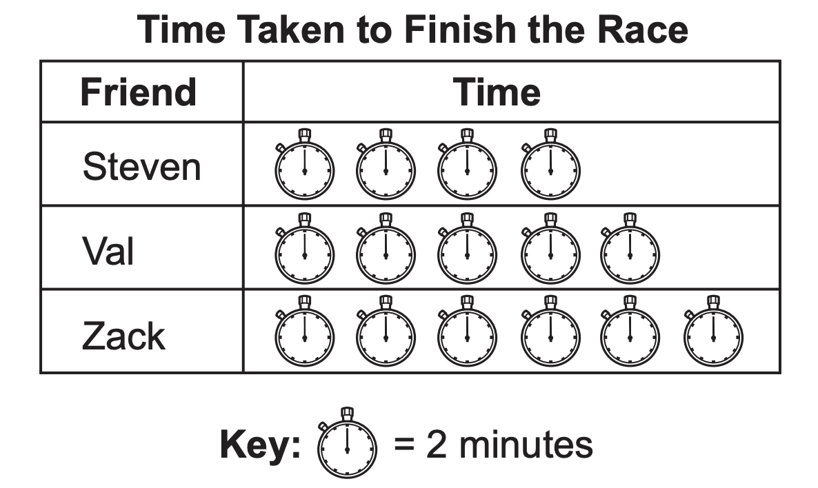
Three friends ran in a race.
The race started at 12:55.
The pictograph below shows the time it took each friend to finish the race.
At what time did Zack finish the race?
60
1:05
1:01
1:07
1:00
Q 2/4
Score 0
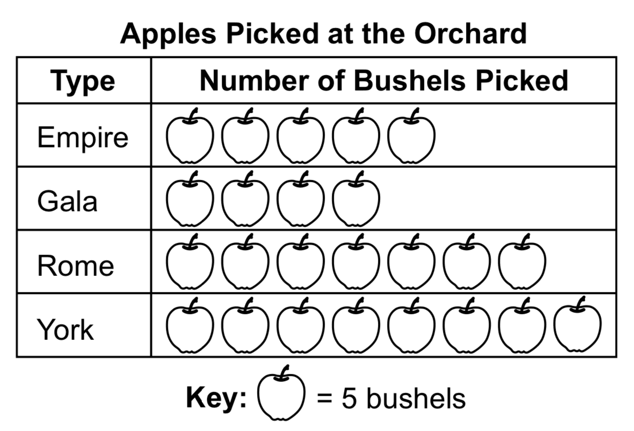
Workers at an apple orchard picked four different types of apples.
They recorded the numbers of bushels of apples picked in the graph below.
How many fewer bushels of Empire apples than York apples were picked?
60
3
8
15
5
4 questions
Q.
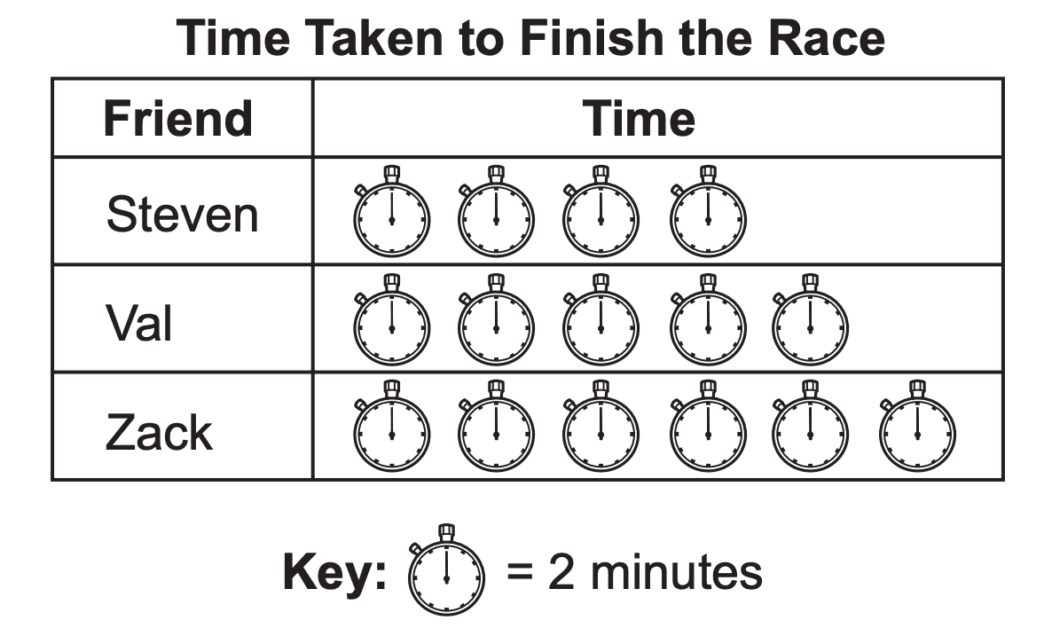
Three friends ran in a race.
The race started at 12:55.
The pictograph below shows the time it took each friend to finish the race.
At what time did Zack finish the race?
1
60 sec
M03.D-M.2.1.2
Q.
Workers at an apple orchard picked four different types of apples.
They recorded the numbers of bushels of apples picked in the graph below.
How many fewer bushels of Empire apples than York apples were picked?
2
60 sec
M03.D-M.2.1.2
Q.
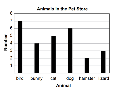
The graph shows the favorite lunch menu choices of Tamara's third-grade class.
How many students chose chicken nuggets or hot dog as their favorite lunch menu choices?