Loading...
Q2
Quiz by Dmitry Kislitsyn
Tag the questions with any skills you have. Your dashboard will track each student's mastery of each skill.
A histogram is most commonly used to analyse which of the following?
The hotel manager has collected data on the number of rooms occupied each evening for the past 700 nights. The fewest rooms occupied during that period was 11 and the most was the capacity, 430. Based on this information, which of the following would be reasonable class limits for the first class if the manager wishes to use 8 classes to develop a frequency distribution?
Recently a study of fans attending the FC Zenit soccer games was conducted and 500 fans were surveyed. In forming a frequency distribution of the number of kilometres fans traveled from home to the stadium, it was found that 247 fans traveled between 0 and 5 kilometres. Based on this information what was the relative frequency for this class?
Frequency distribution can be formed from which of the following types of data?
Which of the following is NOT considered desirable when constructing a frequency distribution for continuous data?
A histogram is used to display which of the following characteristics for a quantitative variable?
When using Excel's Histogram option under the Data Analysis tool, the term bins refers to:
Which of the following is NOT true of a bar chart?
The city counsel has just voted to pass the city's budget for next year. If you were writing a report describing the budget so the citizens could understand how the total tax dollars will be spent, which of the following graphs might be most appropriate?
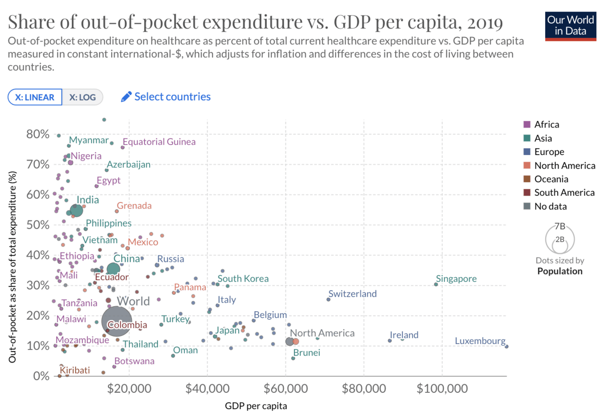
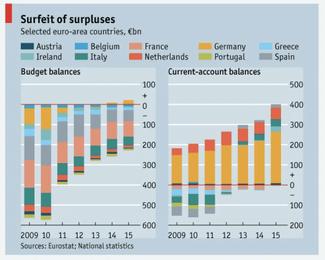
Consider the following chart. Which of the following statements is most correct?
What is the main problem with this data visualisation?
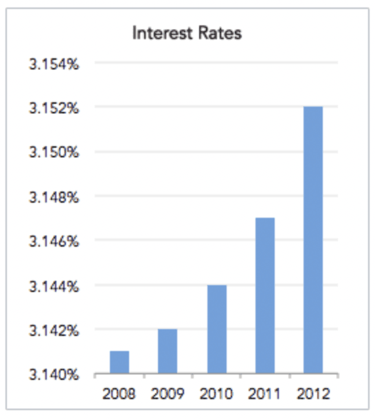
What is the main problem with this data visualisation?
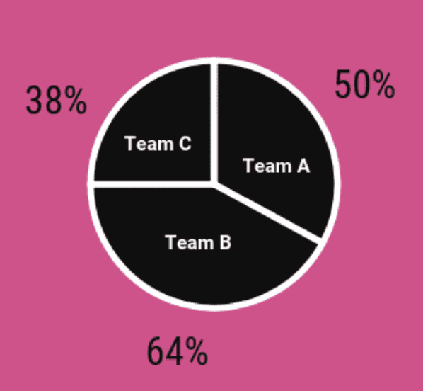
What is the best way to correct the following chart?
What type of data visualisation is it?
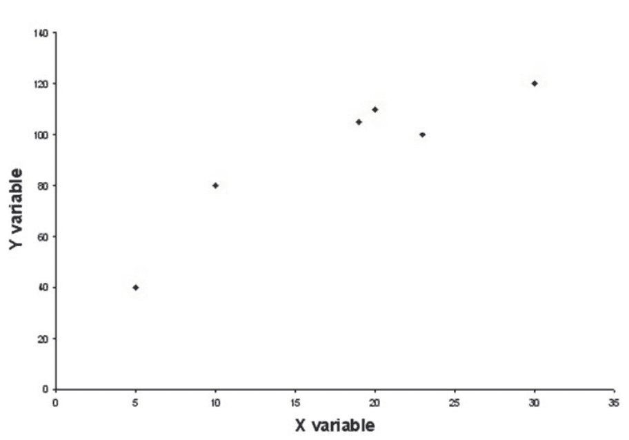
What conclusion can you make from the following scatter plot?