Tag the questions with any skills you have. Your dashboard will track each student's mastery of each skill.
Give this quiz to my class
Q 1/15
Score 0
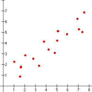
The correlation seen in the graph at the right would be best described as:
30
no correlation
what's a correlation
negative correlation
positive correlation
Q 2/15
Score 0
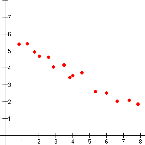
The correlation seen in the graph at the right would be best described as:
30
negative correlation
positive correlation
no correlation
15 questions
Q.
The correlation seen in the graph at the right would be best described as:
1
30 sec
Q.
The correlation seen in the graph at the right would be best described as:
2
30 sec
Q.
The correlation seen in the graph at the right would be best described as:
3
30 sec
Q.
You are going to write an equation of a line for the scatter plot shown. What should you do first?
4
30 sec
Q.
TRUE or FALSE: When data is graphed and a positive correlation is observed, the FIRST set of data is always causing the affect seen in the second set of data.
5
30 sec
Q.
The scatter plot shows the temperature in relation to the number of visitors at the beach. If you predict the number of people that would show up at the beach to be 700, you would be:
6
30 sec
Q.
When making a scatter plot you should never
7
30 sec
Q.
If you were asked to interpolate information from this graph, you would have to be careful to limit the temperature range to:
8
30 sec
Q.
Another term for line of best fit is:
9
30 sec
Q.
Prepare a scatter plot for the following data. Determine from your graph whether there is a correlation between the number of hours spent in the mall and the number of dollars spent.
10
30 sec
Q.
The following chart shows the prices of gasoline and milk at a local convenience store for a period of three weeks. Examine this data for correlation between the price of gasoline and milk. What do you think the correlation is between these two?
11
30 sec
Q.
Which situation describes a situation that is NOT a casual relationship?
12
30 sec
Q.
What can be said about a student's study habits based on their grade point average?
13
30 sec
Q.
Which scatter plot best represents the data pairs: (10,2); (40, 10); (15, 5); (5, 3); (55, 9); (30, 8); (25, 6)
14
30 sec
Q.
Given in the table and scatter plot are the number of negative consumer reviews and the number of smartphones sold. Pick two points from the line of best fit and determine the equation for the line of best fit.