represent categorical data with bar graphs or frequency tables and numerical data, including data sets of measurements in fractions or decimals, with dot plots or stem-and-leaf plots
solve one- and two-step problems using data from a frequency table, dot plot, bar graph, stem-and-leaf plot, or scatterplot
Track each student's skills and progress in your Mastery dashboards
Give this quiz to my class
Q 1/10
Score 0
The thicknesses of the boards Dennis used for a construction project are listed below. These measurements are in inches.
1/4, 3/4, 1/2, 3/4, 1/8, 1, 5/8, 3/4, 1/2
Which dot plot represents these measurements?
60
#texas/506c1aa2-020f-4c86-82ba-573d960f6c77/A.png
#texas/506c1aa2-020f-4c86-82ba-573d960f6c77/C.png
#texas/506c1aa2-020f-4c86-82ba-573d960f6c77/D.png
#texas/506c1aa2-020f-4c86-82ba-573d960f6c77/B.png
Q 2/10
Score 0
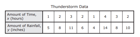
The table shows the amount of time eight thunderstorms lasted and the amount of rainfall each thunderstorm produced. Which scatterplot best represents the data?Which scatterplot best represents the data?
60
#texas/a2de442d-a331-42c6-88e8-23ae3da38519/A.png
#texas/a2de442d-a331-42c6-88e8-23ae3da38519/C.png
#texas/a2de442d-a331-42c6-88e8-23ae3da38519/D.png
#texas/a2de442d-a331-42c6-88e8-23ae3da38519/B.png
10 questions
Q.
The thicknesses of the boards Dennis used for a construction project are listed below. These measurements are in inches.
1/4, 3/4, 1/2, 3/4, 1/8, 1, 5/8, 3/4, 1/2
Which dot plot represents these measurements?
1
60 sec
5.9.A: Data Analysis
Q.
The table shows the amount of time eight thunderstorms lasted and the amount of rainfall each thunderstorm produced. Which scatterplot best represents the data?Which scatterplot best represents the data?
2
60 sec
5.9.B: Data Analysis
Q.
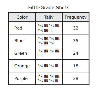
The frequency table shows the colors that fifth graders preferred for their school shirts. Based on the data in the table, how many students preferred the three colors that had the highest frequencies?
3
60 sec
5.9.C: Data Analysis
Q.
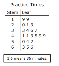
The stem and leaf plot shows the numbers of minutes the members of a team jumped rope during practice. What is the difference between the least number of minutes jumped and the greatest number of minutes jumped?
4
60 sec
5.9.C: Data Analysis
Q.
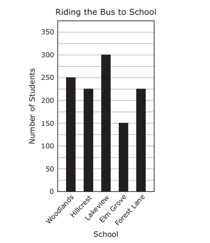
The graph shows the number of students at five schools who ride the bus to school. Based on the graph, how many students ride the bus to the Woodlands, Hillcrest, and Lakeview schools?
5
60 sec
5.9.C: Data Analysis
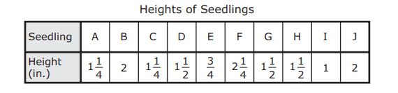
Q.
The table shows the heights of 10 seedlings. Which dot plot represents these data?
6
60 sec
5.9.A: Data Analysis
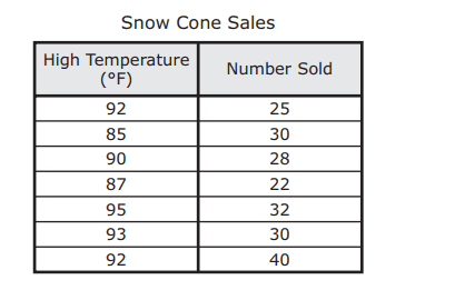
Q.
The table shows the high temperatures and the numbers of snow cones sold at a snack bar on seven days. Which scatterplot best represents the data in the table?
7
60 sec
5.9.B: Data Analysis
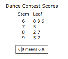
Q.
The stem and leaf plot shows the scores of eight people at a dance contest. What is the difference between the highest score and the lowest score?
8
60 sec
5.9.C: Data Analysis
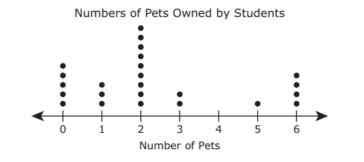
Q.
The dot plot shows the numbers of pets that the students in a class own. What fraction of the students in this class have two or more pets?
9
60 sec
5.9.C: Data Analysis
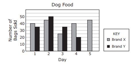
Q.
The bar graph shows the numbers of bags of two brands of dog food that were sold at a store. One bar for Day 5 is missing from the graph. The number of bags of Brand Y dog food sold on these five days was 175. Which bar represents the data for Day 5 for Brand Y?