Our brand new solo games combine with your quiz, on the same screen

Correct quiz answers unlock more play!

New Quizalize solo game modes
7 questions
Show answers
  • Q1
    The graph shows the number of rolls of wrapping paper sold by four students. Which table represents the information in the graph?
    Question Image
    Answer Image
    Answer Image
    Answer Image
    Answer Image
    60s
    3.8.A: Data Analysis
  • Q2
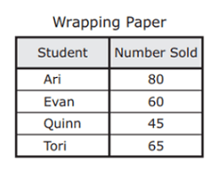
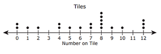
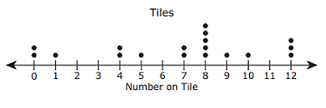
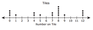
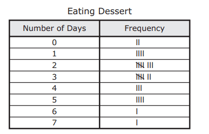
    Merlin had a bag of tiles. Each tile was labeled with a number. Merlin pulled one tile out of the bag and recorded the number on that tile. He repeated this $18$ times. The numbers on the tiles Merlin pulled are shown in the list. 8, 7, 12, 1, 8, 9, 12, 0, 7, 8, 10, 4, 5, 8, 12, 4, 0, 8 Which dot plot represents the numbers on the tiles Merlin pulled out of the bag?
    Answer Image
    Answer Image
    Answer Image
    Answer Image
    60s
    3.8.A: Data Analysis
  • Q3
    The graph shows the number of rings Mrs. Adams sold during six weeks at her jewelry store. What is the total number of rings Mrs. Adams sold during weeks 4, 5, and 6? Be sure to use the correct place value.
    Question Image
    102
    106
    108
    104
    60s
    3.8.B: Data Analysis
  • Q4
    The bar graph shows the number of third graders who brought lunch to school each day last week. Which table best represents the data in the graph?
    Question Image
    Answer Image
    Answer Image
    Answer Image
    Answer Image
    60s
    3.8.A: Data Analysis
  • Q5
    The frequency table shows the results of a survey about how many days per week some families eat dessert. Which dot plot represents the data in the table?
    Question Image
    Answer Image
    Answer Image
    Answer Image
    Answer Image
    60s
    3.8.A: Data Analysis
  • Q6
    The graph below shows the number of pounds of plastic the Keller family recycled for five months. Based on the graph, how many more pounds of plastic did the family recycle in July than in April? Be sure to use the correct place value.
    Question Image
    80
    40
    60
    20
    60s
    3.8.B: Data Analysis
  • Q7
    The graph below shows the number of miles Lincoln rode his bike during six weeks. Which table represents the information in the graph?
    Question Image
    Answer Image
    Answer Image
    Answer Image
    Answer Image
    60s
    3.8.A: Data Analysis

Teachers give this quiz to your class