Summarize, represent, and interpret data on two categorical and quantitative variables.
Track each student's skills and progress in your Mastery dashboards
Give this quiz to my class
Q 1/6
Score 0
60
Q 2/6
Score 0
Bella recorded data and used her graphing calculator to fi nd the equation for the line of best fi t. She then used the correlation coeffi cient to determine the strength of the linear fi t.
Which correlation coeffi cient represents the strongest linear relationship?
60
-0.8
-0.3
0.9
0.5
6 questions
Q.
1
60 sec
AI-S-ID.C
Q.
Bella recorded data and used her graphing calculator to fi nd the equation for the line of best fi t. She then used the correlation coeffi cient to determine the strength of the linear fi t.
Which correlation coeffi cient represents the strongest linear relationship?
2
60 sec
AI-S-ID.C
Q.
The heights, in inches, of 12 students are listed below. computations.
61, 67, 72, 62, 65, 59, 60, 79, 60, 61, 64, 63
Which statement best describes the spread of these data?
3
60 sec
AI-S-ID.A
Q.
The box plot below summarizes the data for the average monthly high temperatures in degrees Fahrenheit for Orlando, Florida.
The third quartile is
4
30 sec
AI-S-ID.A
Q.
What percentage of the students chose soccer as their favorite sport?
5
30 sec
AI-S-ID.B
Q.
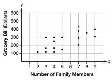
The scatter plot below shows the relationship between the number of members in a family and the amount of the family's weekly grocery bill.
The most appropriate prediction of the grocery bill for a family that consists of six members is