summarize categorical data with numerical and graphical summaries, including the mode, the percent of values in each category (relative frequency table), and the percent bar graph, and use these summaries to describe the data distribution
summarize numeric data with numerical summaries, including the mean and median (measures of center) and the range and interquartile range (IQR) (measures of spread), and use these summaries to describe the center, spread, and shape of the data distribution
use the graphical representation of numeric data to describe the center, spread, and shape of the data distribution
Track each student's skills and progress in your Mastery dashboards
Give this quiz to my class
Q 1/20
Score 0
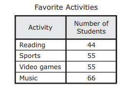
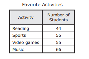
Hector surveyed all the sixth graders at his school about their favorite after-school activity. The table shows the results that were used to make a bar graph. Which percentage bar graph best represents the data?
60
#texas/4daf418f-93c7-4024-a563-b97efbd1e6bb/D.png
#texas/4daf418f-93c7-4024-a563-b97efbd1e6bb/B.png
#texas/4daf418f-93c7-4024-a563-b97efbd1e6bb/C.png
#texas/4daf418f-93c7-4024-a563-b97efbd1e6bb/A.png
Q 2/20
Score 0
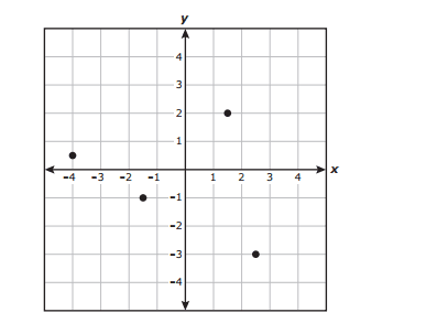
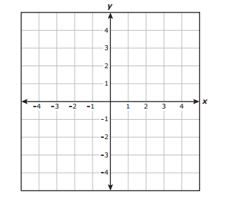
Four points are graphed on the coordinate grid. Which ordered pair does not appear to be represented by one of these points?
60
(-4, 1/2)
(5/2,- 3)
(-1, - 1 1/2)
(3/2,2)
20 questions
Q.
Hector surveyed all the sixth graders at his school about their favorite after-school activity. The table shows the results that were used to make a bar graph. Which percentage bar graph best represents the data?
1
60 sec
6.12.D: Measurement and Data
Q.
Four points are graphed on the coordinate grid. Which ordered pair does not appear to be represented by one of these points?
2
60 sec
6.11: Measurement and Data
Q.
Students recorded the amount of liquid in fluid ounces each of them drank in one day. The box plot shows the summary of the results. Which statement best describes the data represented in the box plot?
3
60 sec
6.13.A: Measurement and Data
Q.
The list shows the number of licenses issued every year to lobster boats in Massachusetts for a five-year period.
551, 554, 529, 534, 530
What is the range of these data?
4
60 sec
6.12.C: Measurement and Data
Q.
The line plot shows the number of pounds of fish eaten by each dolphin at a zoo. Which stem and leaf plot best represents the data in the line plot?
5
60 sec
6.12.A: Measurement and Data
Q.
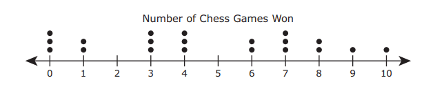
The dot plot shows the number of chess games won by each of the 20 students in a competition. Which statement about the data is true?
6
60 sec
6.12.C: Measurement and Data
Q.
Benisha graphed point G on the coordinate grid. She will graph point H at a location 5 units away from point G. Which ordered pair could represent the location of point H?
7
60 sec
6.11: Measurement and Data
Q.
Shemar bought a bag of marbles. He took the marbles out of the bag one at a time. He recorded the color of each marble in this tally chart.In which table do the percentages represent the relative frequency of these marble colors?
8
60 sec
6.12.D: Measurement and Data
Q.
A choir director made a histogram showing the ages of the members of the choir. Which statement about the data in the histogram must be true?
9
60 sec
6.13.A: Measurement and Data
Q.
The coordinate grid shows points J, K, L, and M. Which point best represents the ordered pair (-2 1/2 , 3)?
10
60 sec
6.11: Measurement and Data
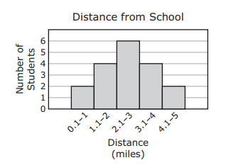
Q.
The distance in miles that some students live from school is shown in the histogram. Which statement about the data in the histogram is true?
11
60 sec
6.12.C: Measurement and Data
Q.
As part of a survey, a group of people were asked to name their preferred method of viewing television shows. Their responses are shown in the table. Which percentage bar graph best represents the data?
12
60 sec
6.12.D: Measurement and Data
Q.
The histogram shows the total number of swimmers in different age groups who participated in a swimming competition. Based on the histogram, which statement is true?
13
60 sec
6.13.A: Measurement and Data
Q.
Which data most likely have variability for one school during a single school year?
14
60 sec
6.13.B: Measurement and Data
Q.
A coordinate grid is shown below. Which ordered pair describes a point that is located 4 units to the left of the origin and 2 units below the x-axis?
15
60 sec
6.11: Measurement and Data
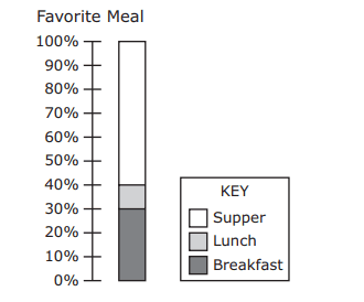
Q.
The students in a class were each asked to name their favorite meal of the day. The results are shown in this percentage bar graph. Which table could be represented by the percentage bar graph?
16
60 sec
6.12.D: Measurement and Data
Q.
The box plots summarize the attendance for the spring musical and the fall musical. Each musical was performed for six evenings. Which statement best describes the data represented in the box plots?
17
60 sec
6.13.A: Measurement and Data
Q.
The total number of items sold by each student who participated in a fund-raiser is shown in the stem and leaf plot. Which statement is best supported by the data in the stem and leaf plot?
18
60 sec
6.13.A: Measurement and Data
Q.
The list shows the area in square feet of each apartment available for rent in a building. 5
65, 961, 867, 517, 627, 714, 517, 728 .
What is the range of these areas in square feet? Be sure to use the correct place value
19
60 sec
6.12.C: Measurement and Data
Q.
The dot plot shows the number of touchdowns a football team scored in 10 games last season. Which statement best describes the data shown in the dot plot?